A redesign to improve completion rates

Paying for college is one of the biggest financial decisions many people face. The Grad Path tool is the only government tool that helps students and their families understand the total cost of their college decision—including both federal and private loans.
Challenge
The tool was a popular CFPB resource, but less than 4% of users reached its final page.
Despite high engagement and average sessions lasting 5–10 minutes, people left the tool after 3 pages. (There were over 20!)
From interviews, we learned that the amount of data entry and the volume of information overwhelmed students. Even guidance counselors felt it was too complex and required too much financial knowledge to use.
Action
Led and managed the project including project kick-offs, stakeholder workshops, team collaboration sessions, research and recommendation presentations to key stakeholders and senior leadership.
Identified areas for improvement through user interviews, clickstream analysis and analytics.
Created an interactive prototype for usability testing and to communicate requirements and functionality.
Result
Through collaboration and user testing feedback, we:
Streamlined data entry by pulling in public datasets to provide quick and easy estimates for students. This way, students see useful insights after a page, rather than after 12.
Simplified language and improved charts and visuals so students understand costs without wordy explanations and complex terms
Significantly improved usability and completion rates.
Company:
Consumer Financial Protection Bureau
Timing:
Summer 2024
Goal:
Get students an estimate in less than 5 minutes.
Skills:
Figma prototyping
Usability testing
Concept sketching
Content strategy
Team leadership
Try it:
Link to live site
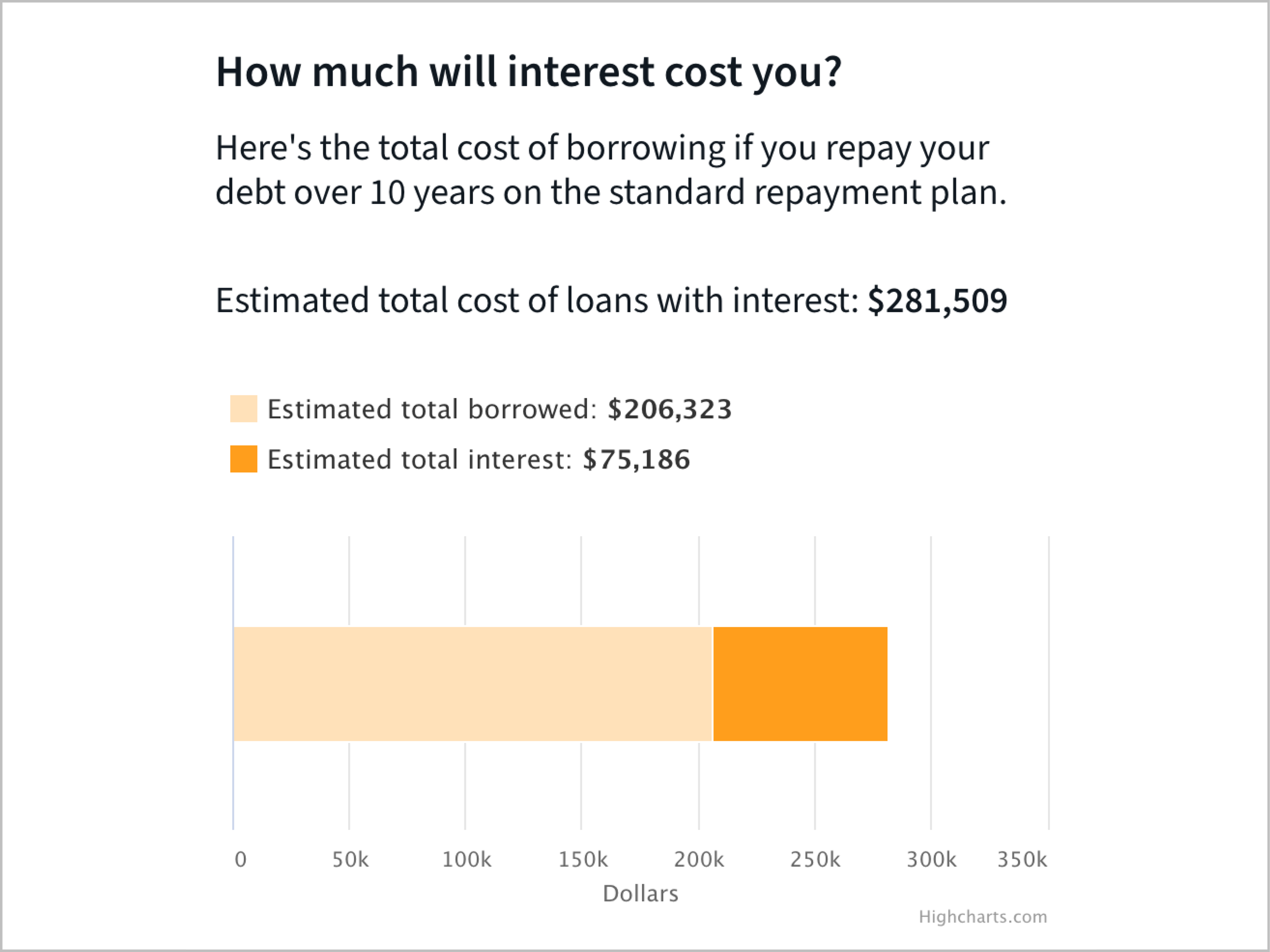
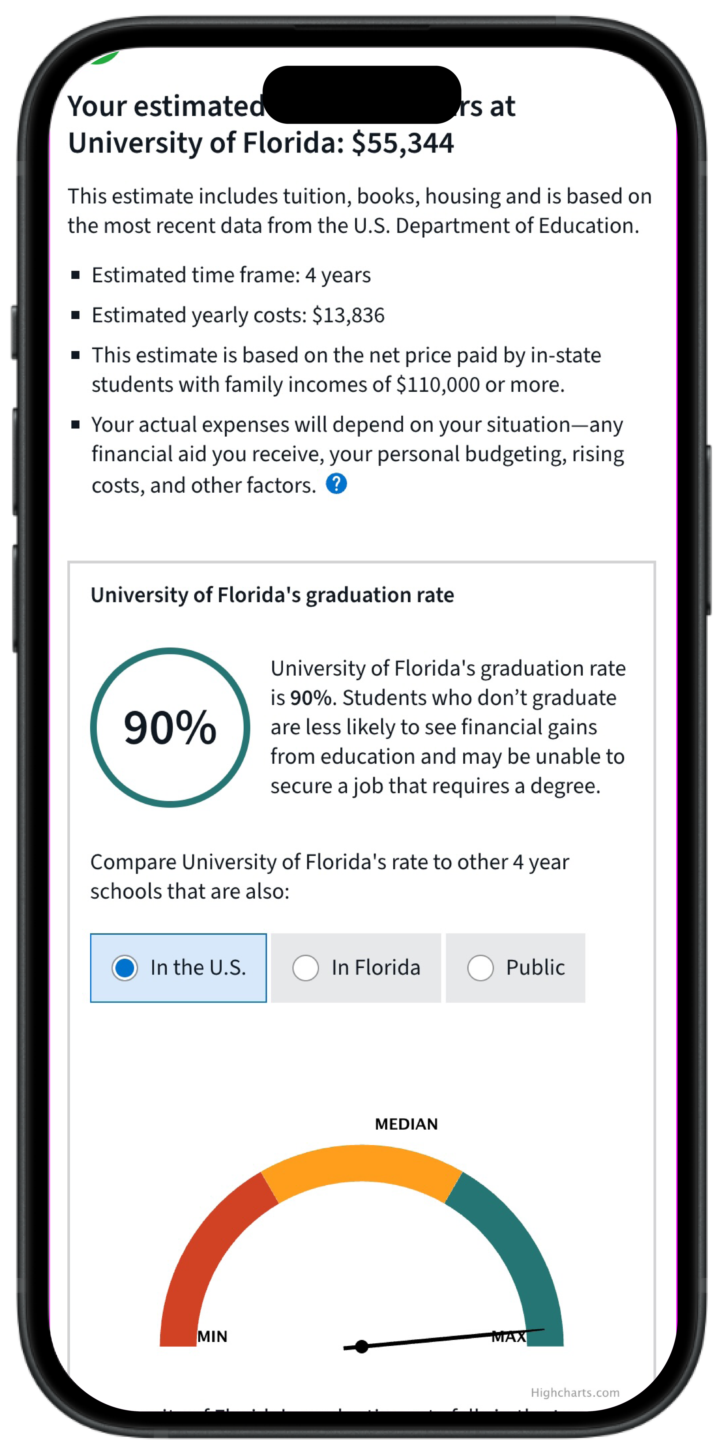
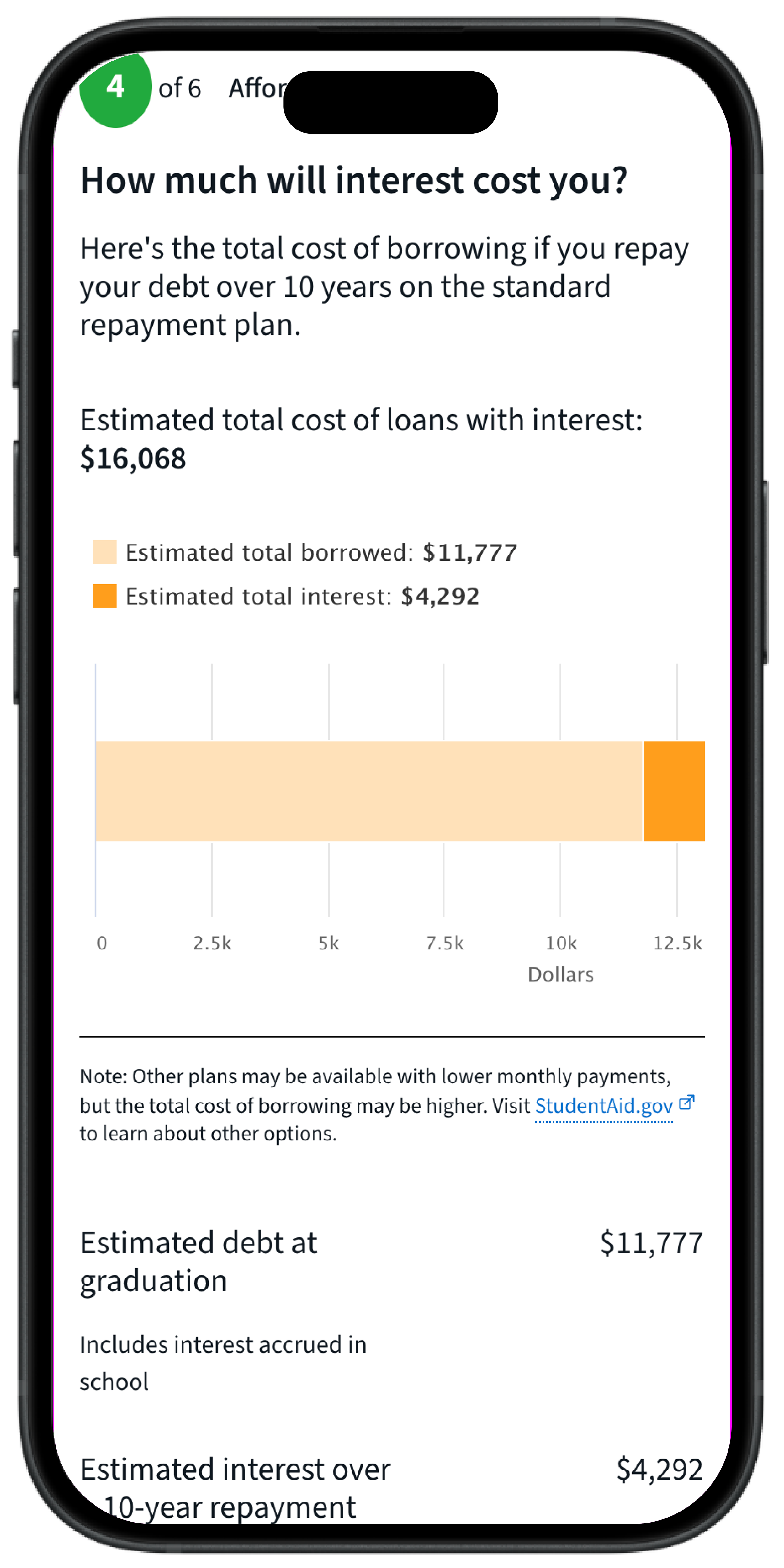
Prominent, clear charts
Charts and data, previously at the end of the tool, begin to appear on the second screen. They help to explain the costs of college without wordy explanations or complex terminology.
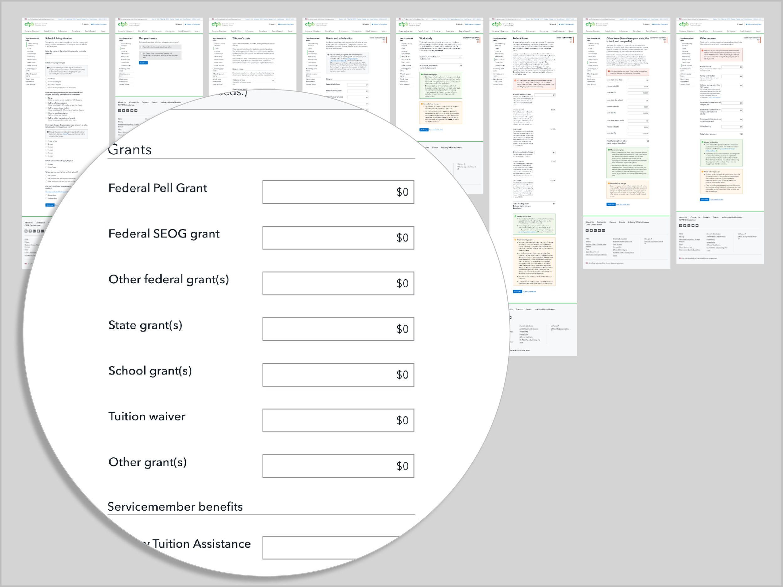
Overwhelming data entry
Before the redesign, students faced 8 pages of data entry. This was possibly manageable on a desktop, but overwhelming on mobile.